1.0.0-beta.8
Adds the Glass theme with real iOS blur, theme-aware background layers across 17 components, a blur variant for FAB.Overlay, themeable chart ramp tokens, and a new NumberPad highlightColor prop.
July 28, 2026
The eighth beta of HeroUI Native Pro ships the second premium theme: Glass — translucent surfaces backed by a real native blur layer on iOS. Making that possible required a new primitive across the library: components now mount a theme-aware background layer so semi-transparent tokens have something to frost against, exposed as a compound part you can retint, replace, or remove. FAB.Overlay also gains a built-in blur variant, and the chart palette moved onto --chart-* tokens so a theme can redefine the whole ramp. There is one breaking change: the NumberPad pressed highlight is now an inline style driven by a new highlightColor prop.
Installation
Follow the installation guide to authenticate the private registry with your HEROUI_PERSONAL_TOKEN, install heroui-native-pro, and wire up HeroUINativeProvider.
What's New
Glass Theme
The new Glass theme restyles every component with frosted translucent surfaces. Unlike brutalism, it is not CSS-only: overlays, fields, and surfaces mount a real blur layer at runtime, powered by the optional expo-blur package.
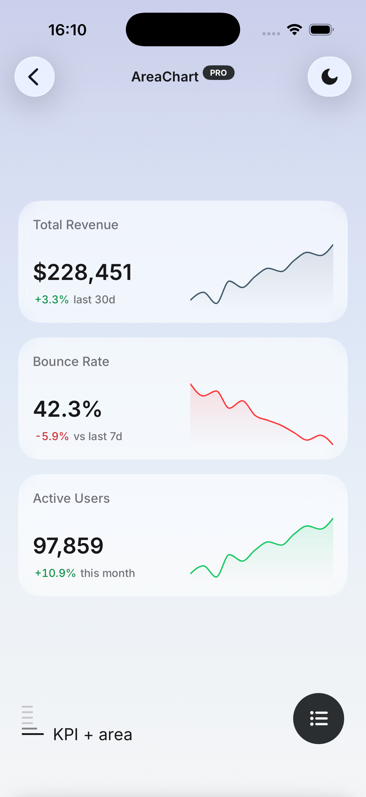
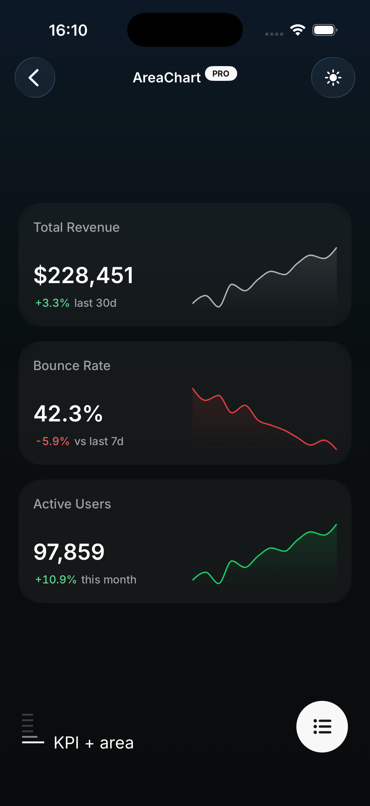
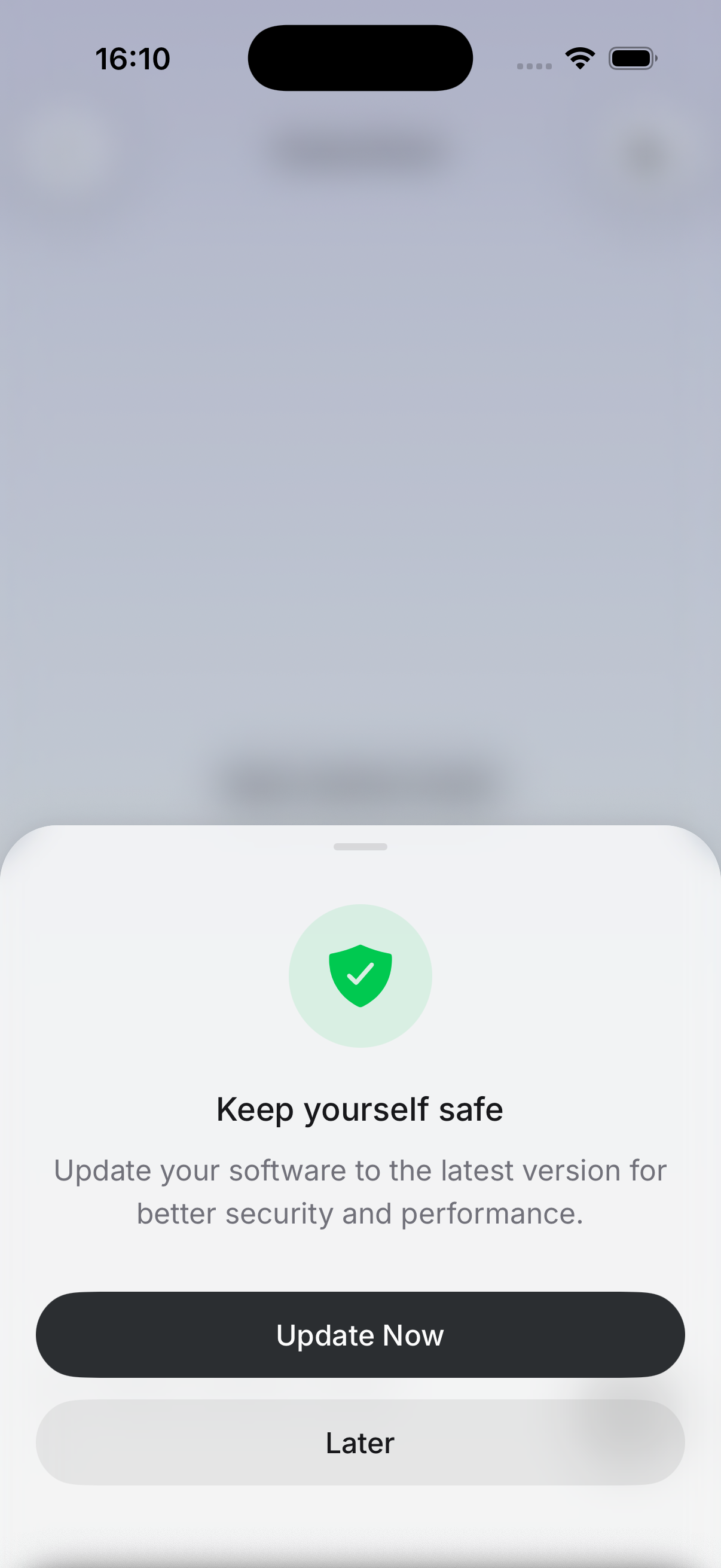
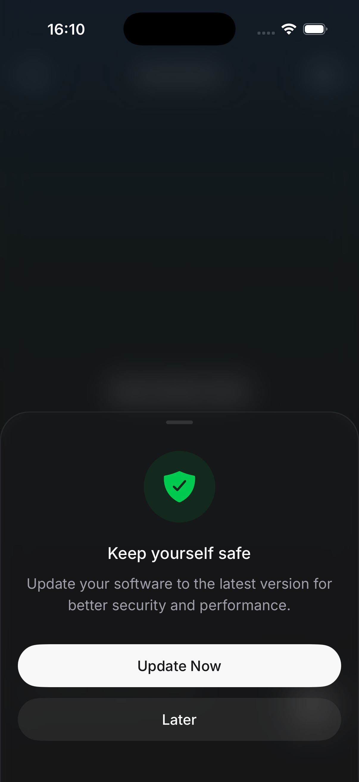
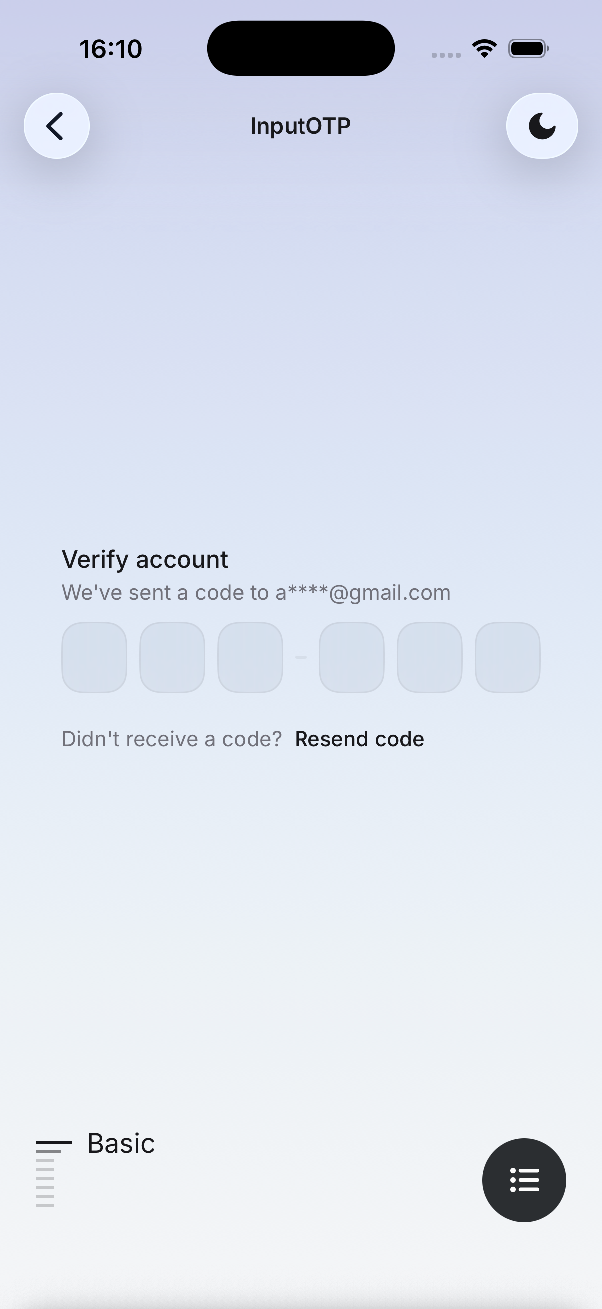
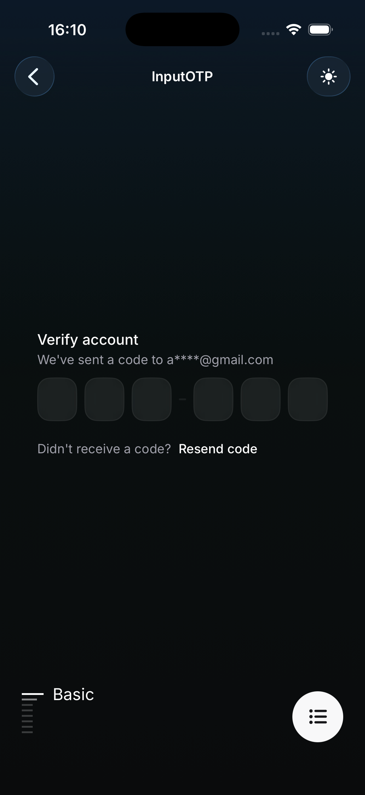
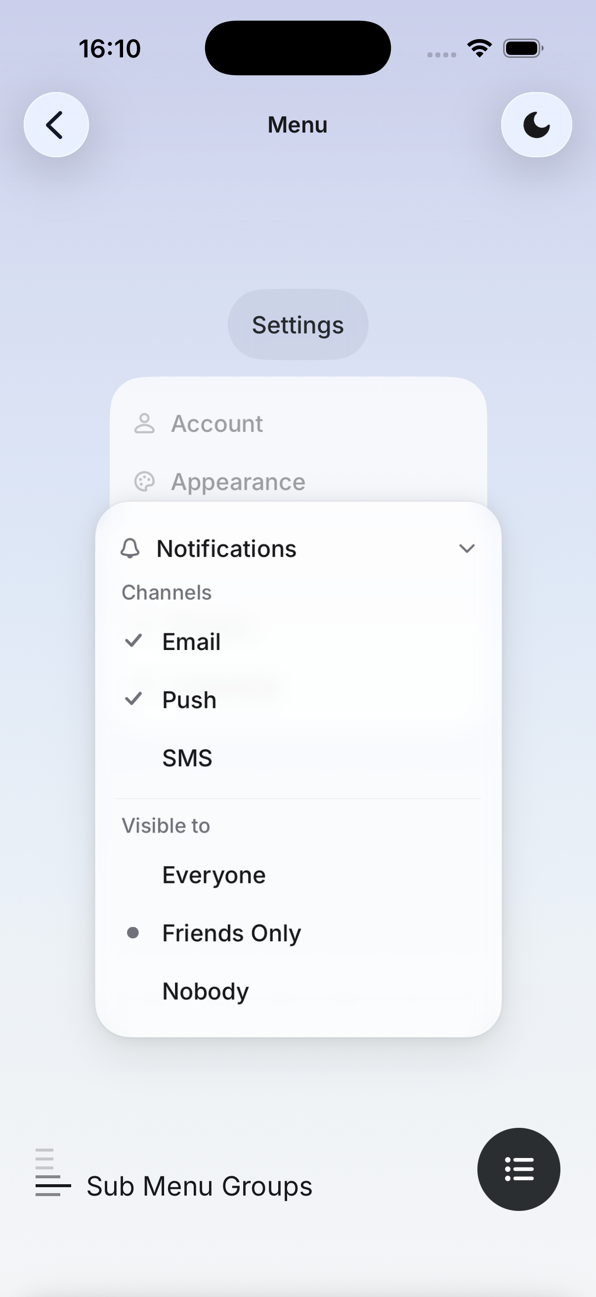
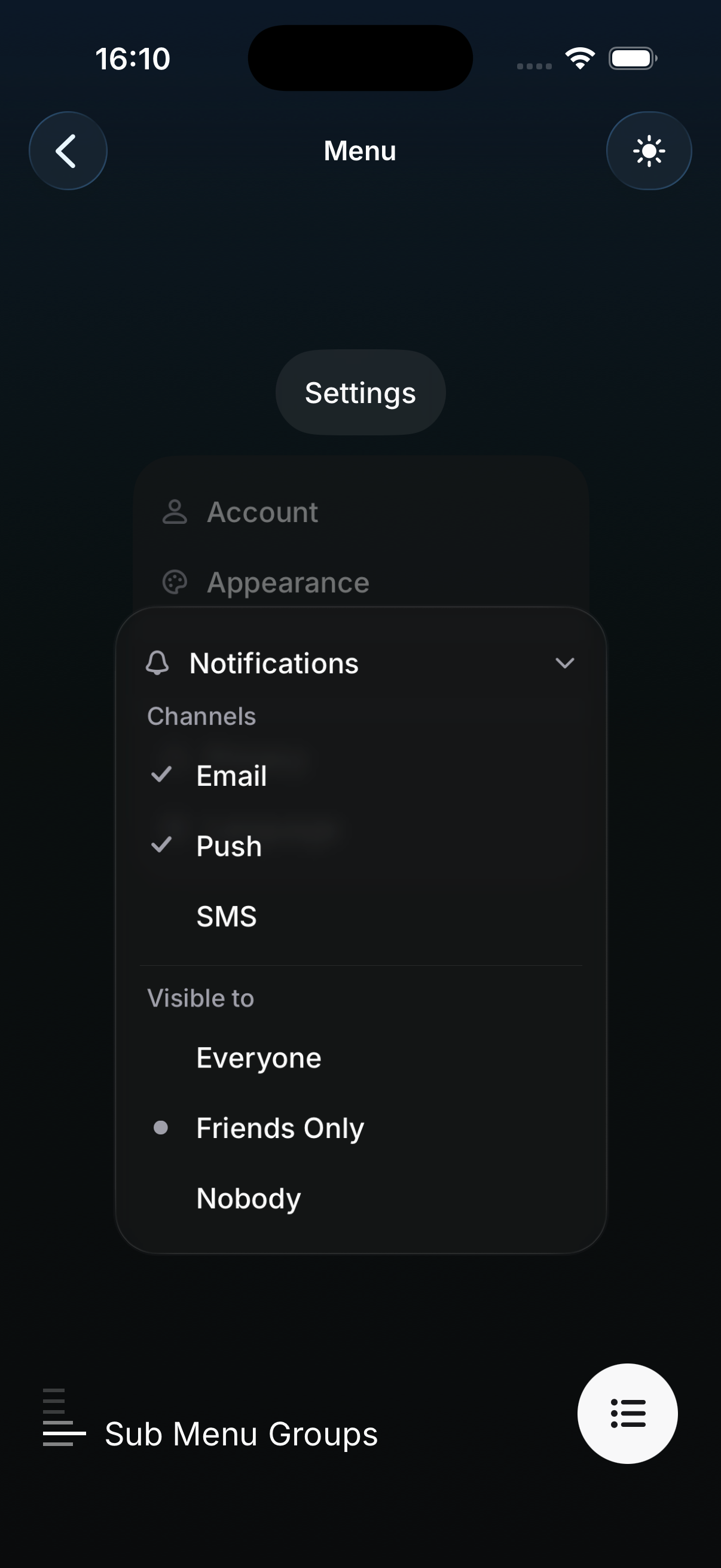
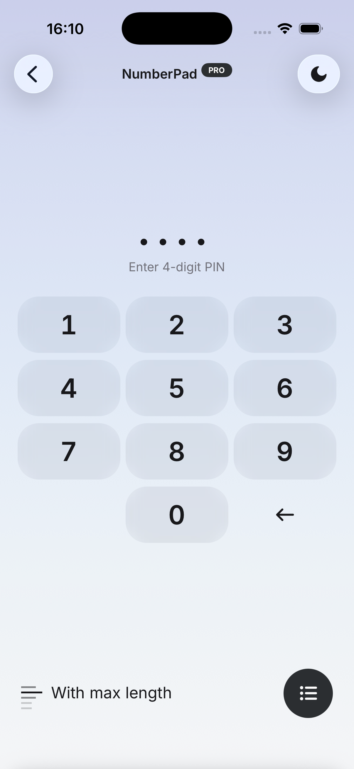
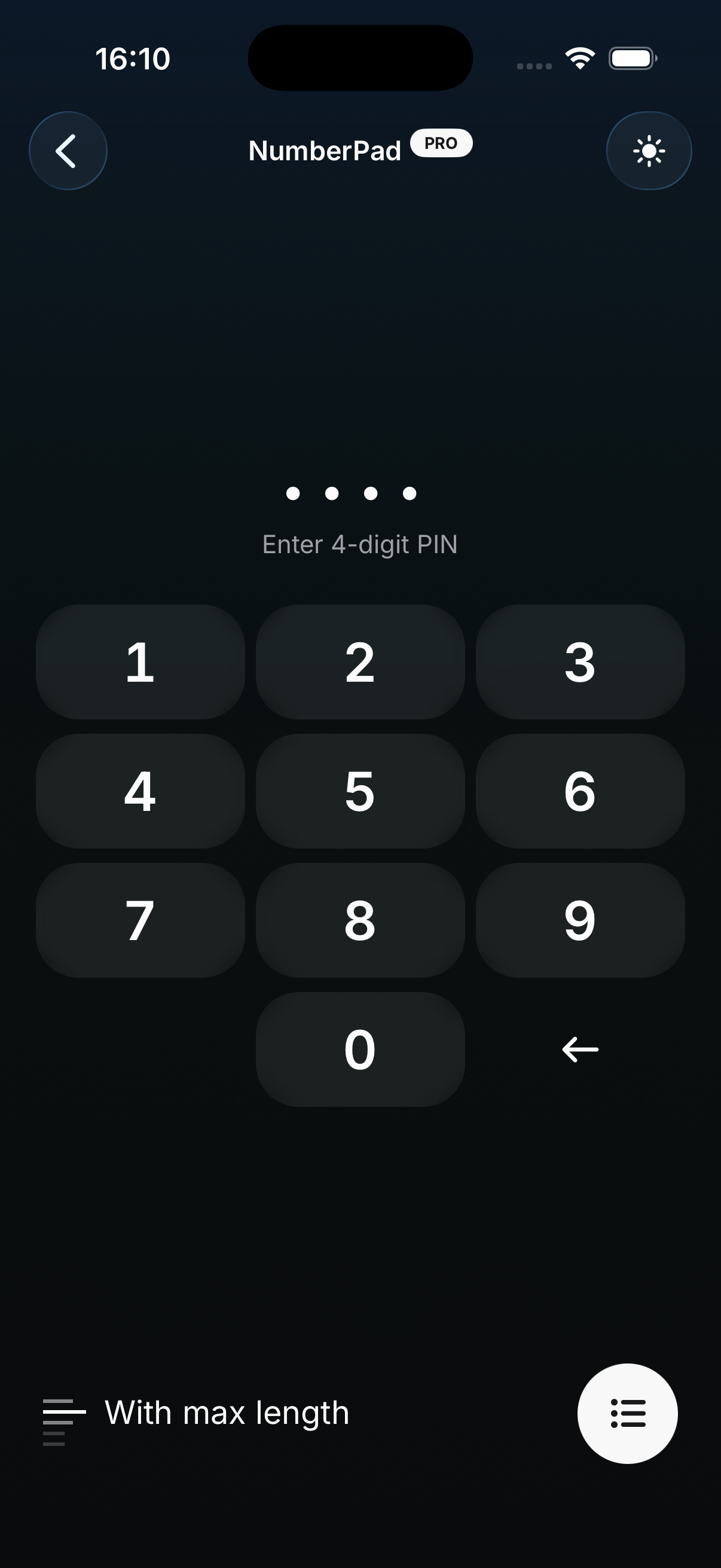
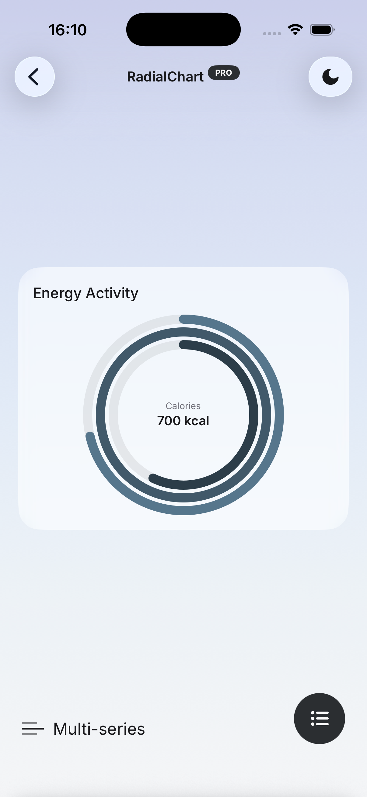
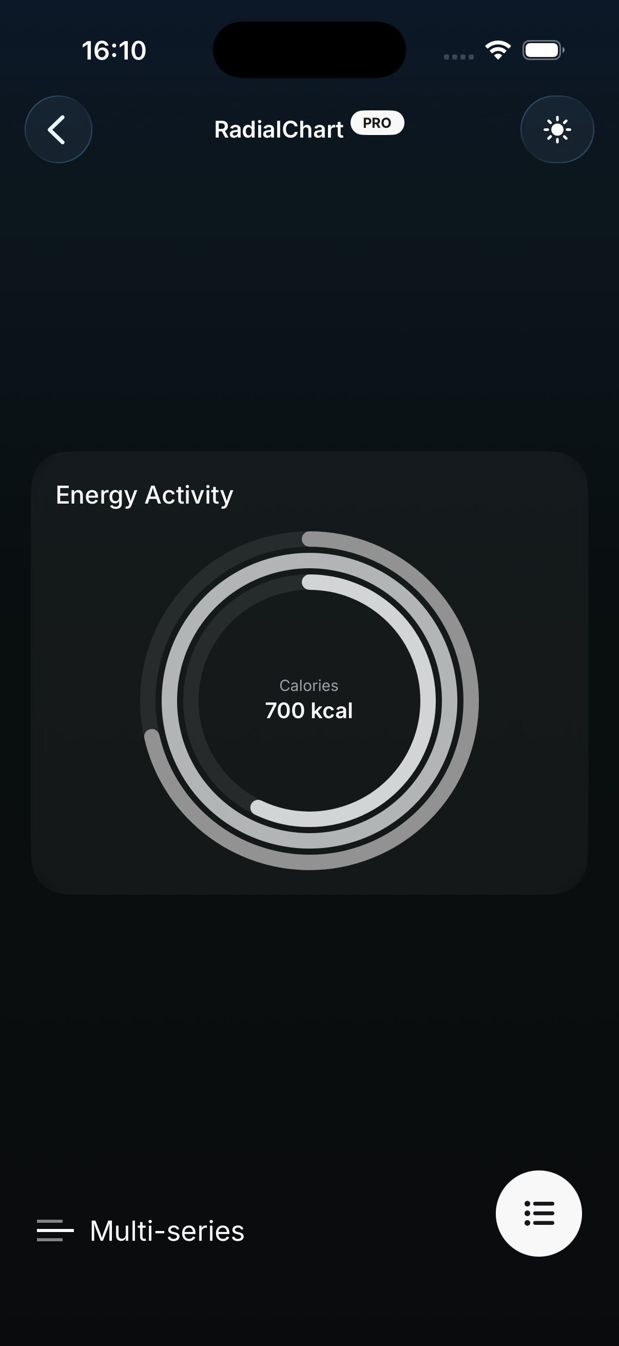
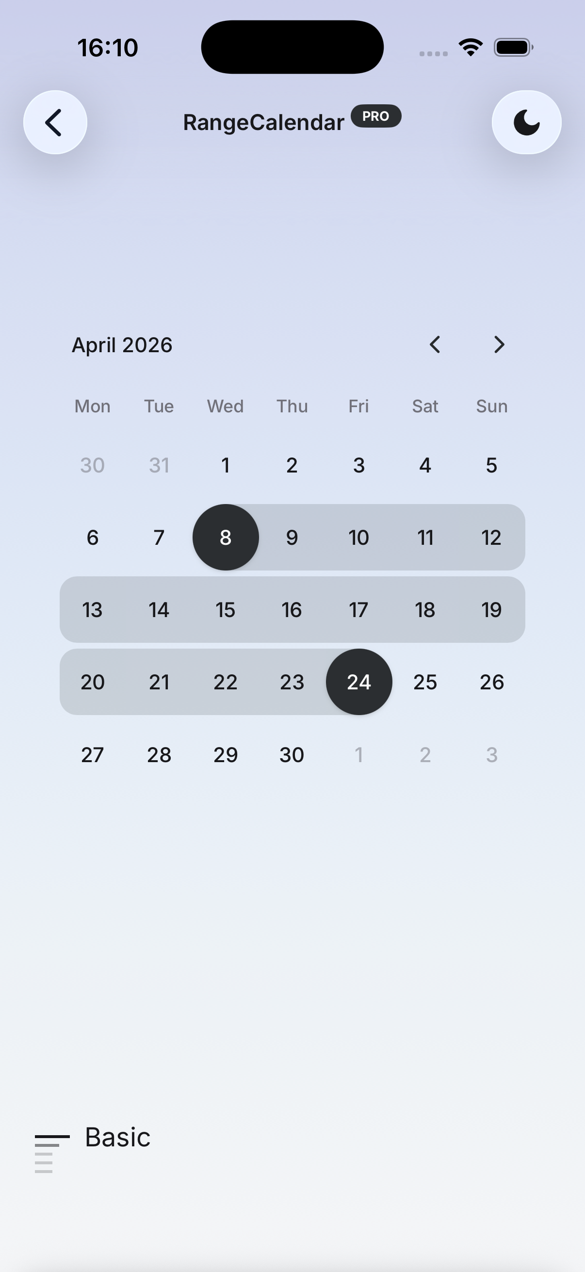
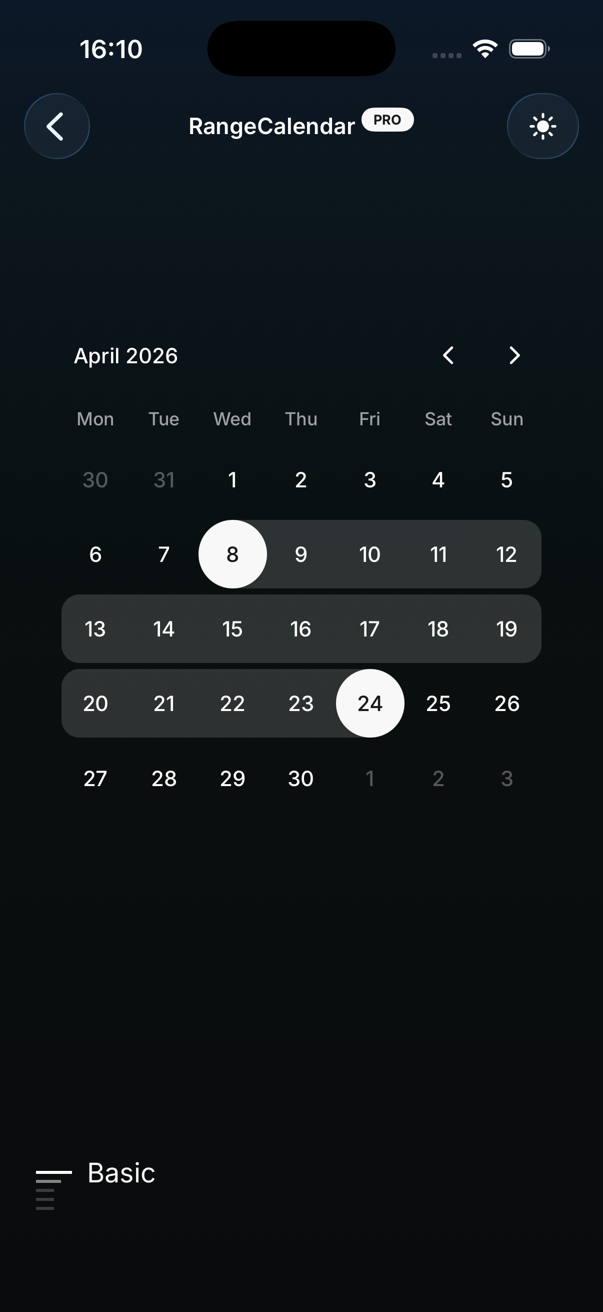
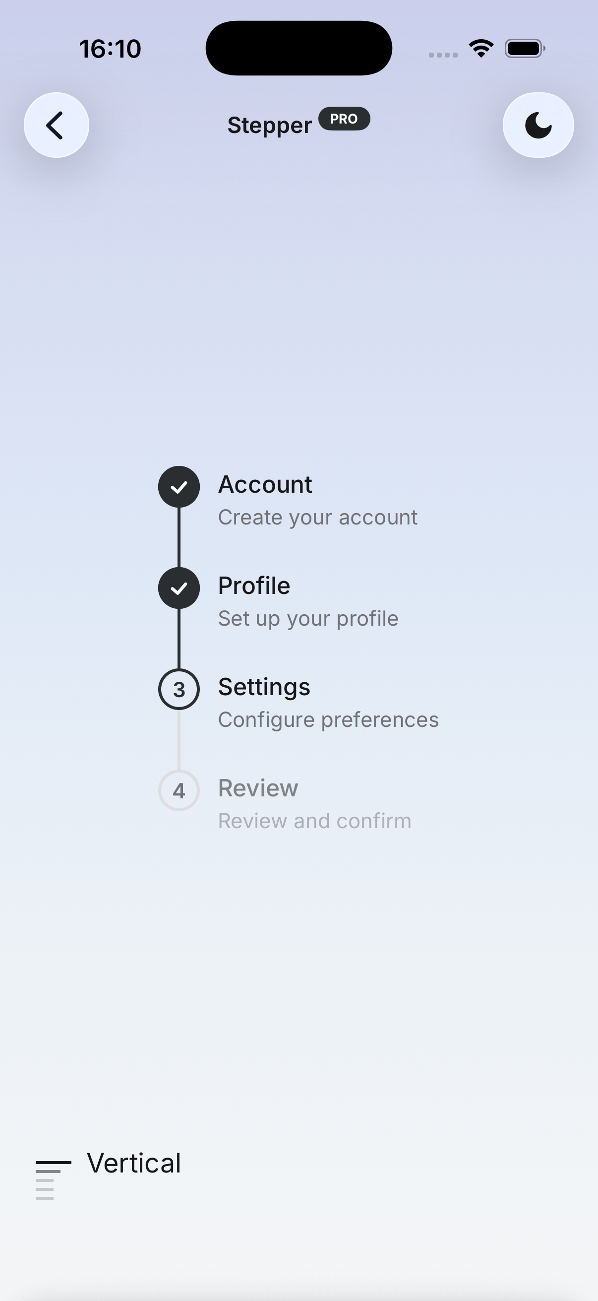
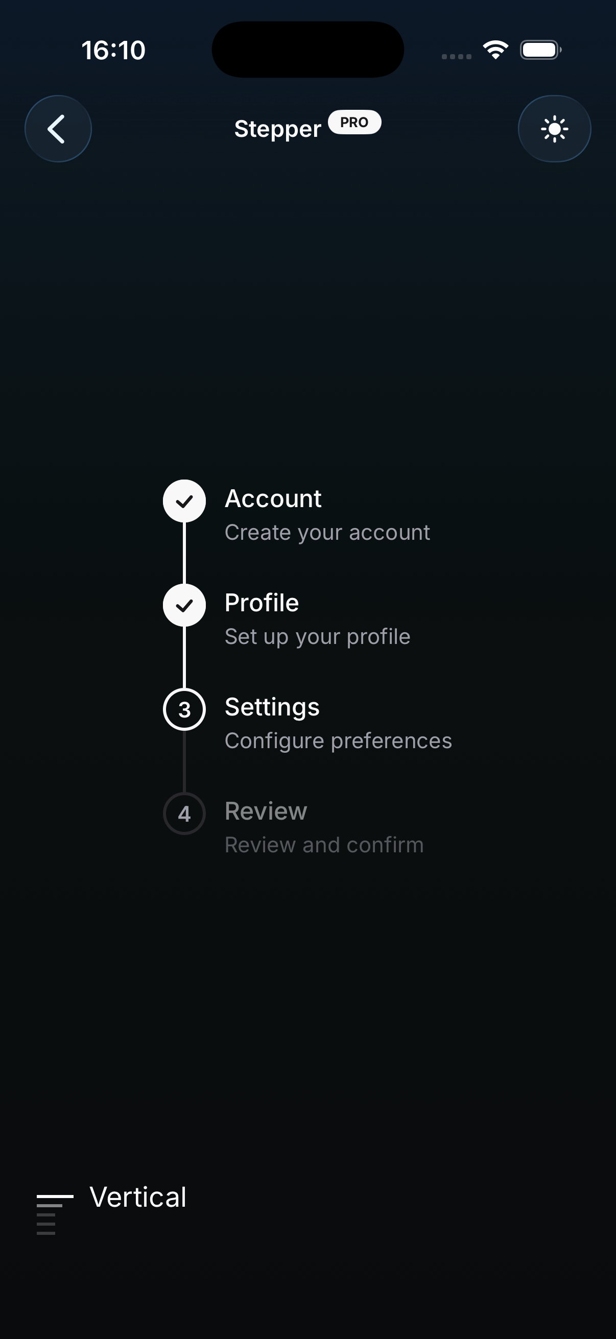
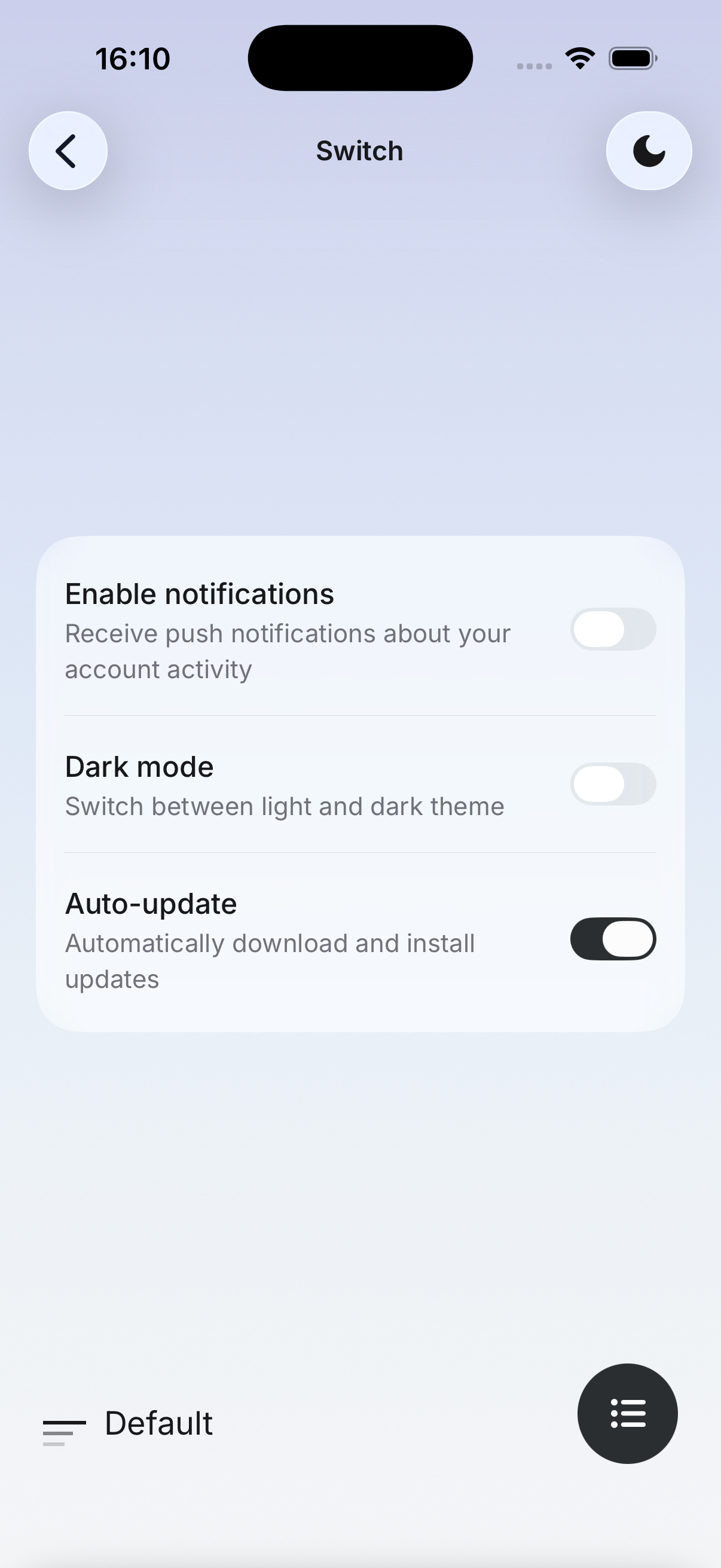
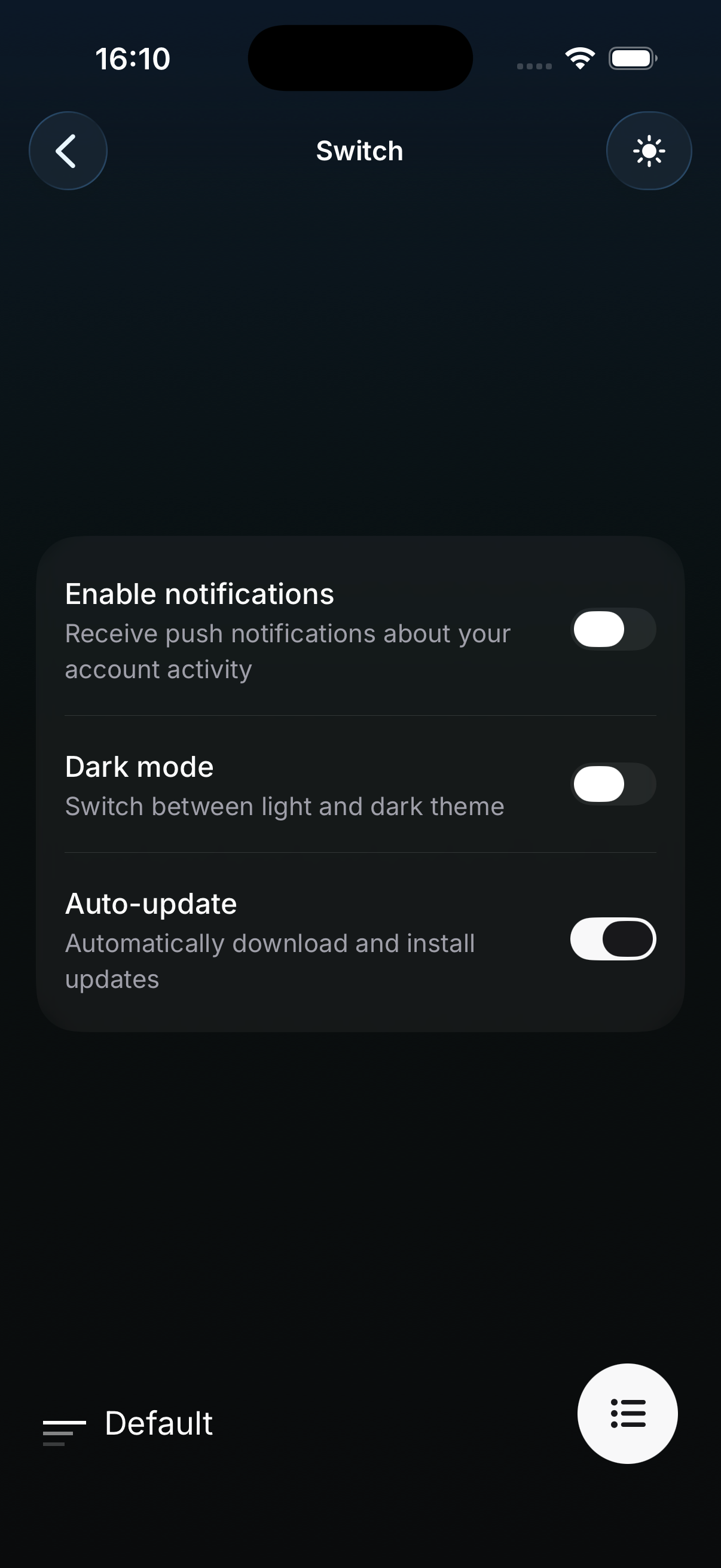
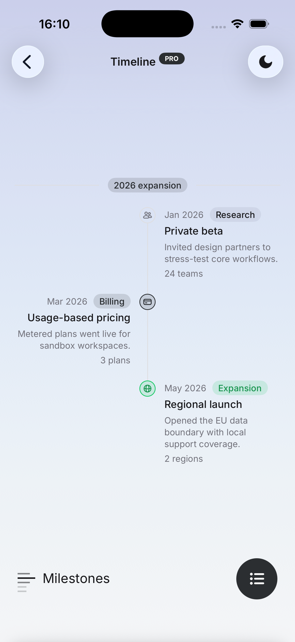
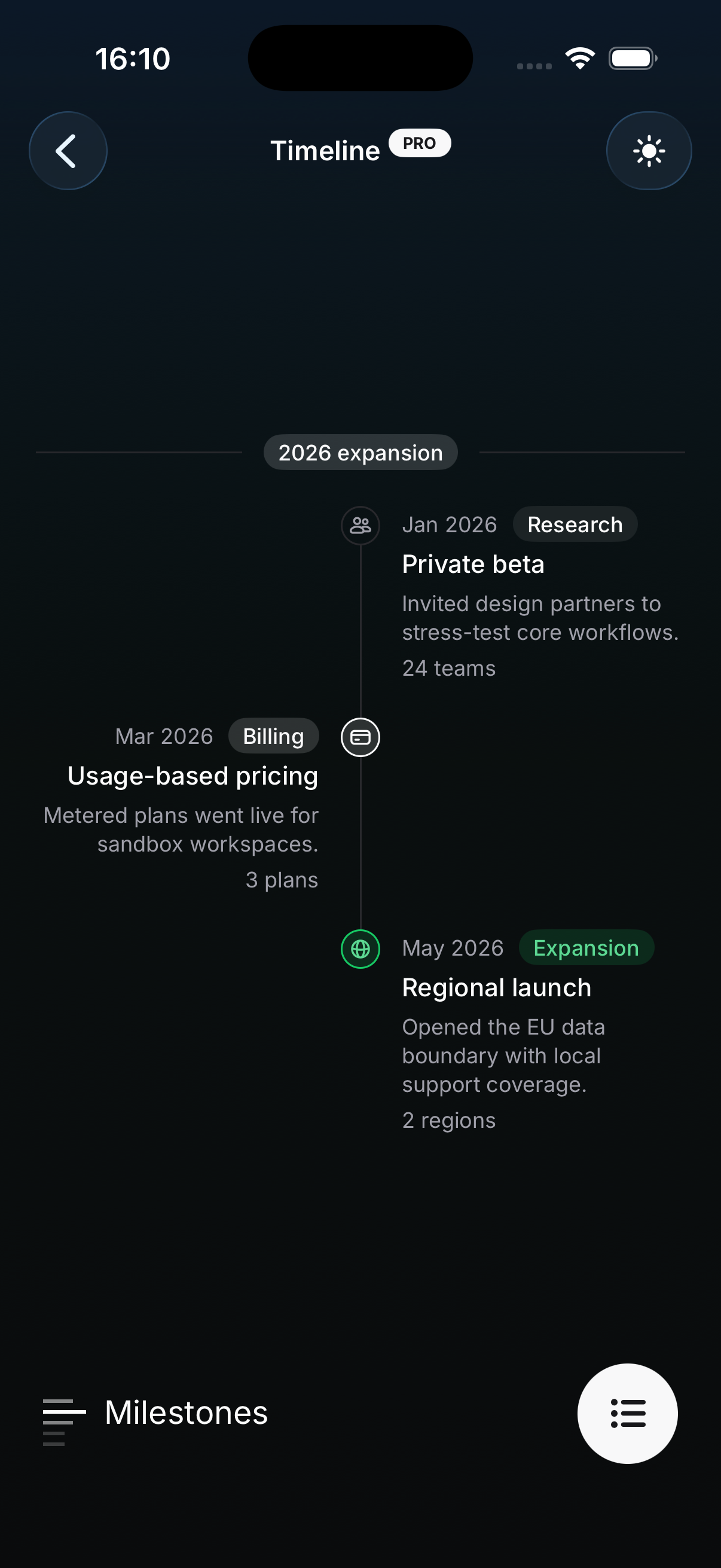
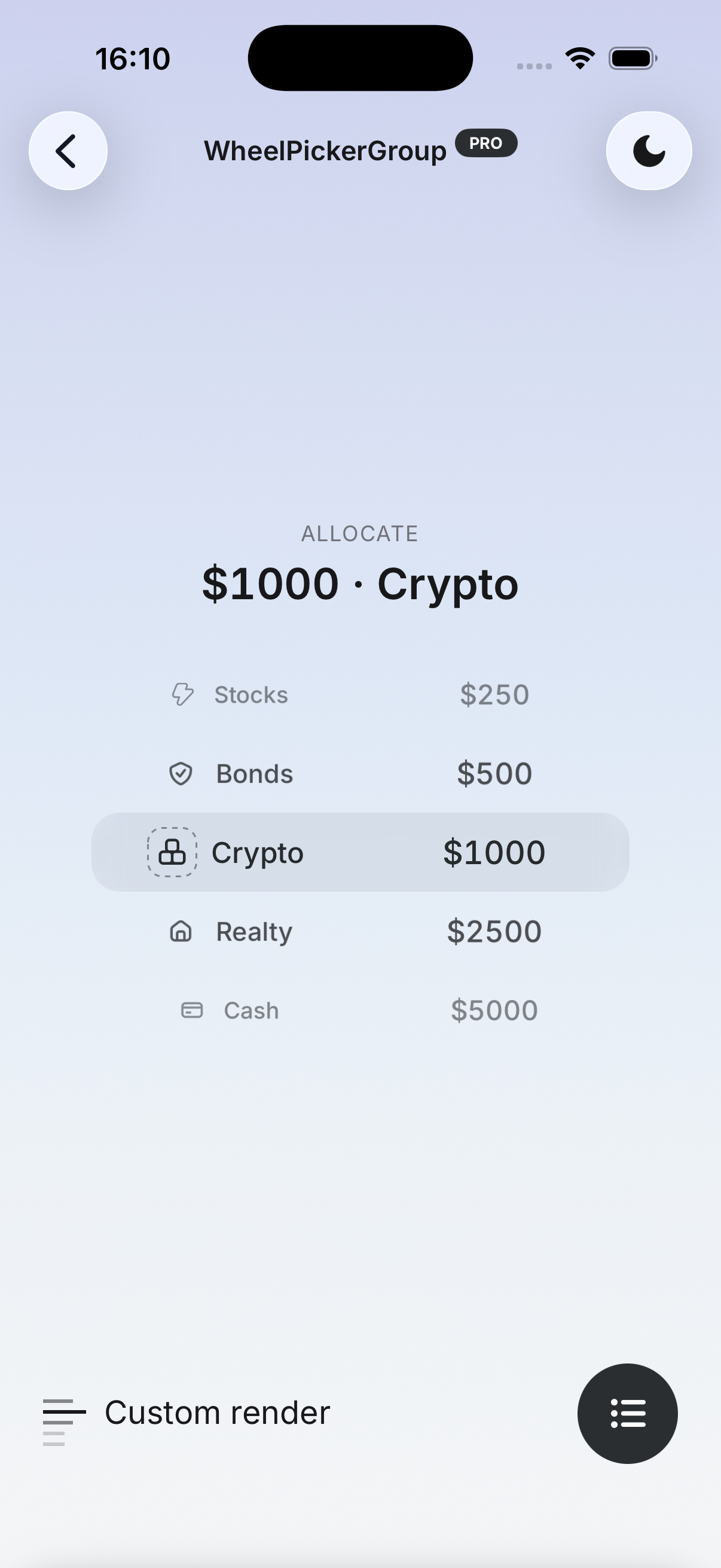
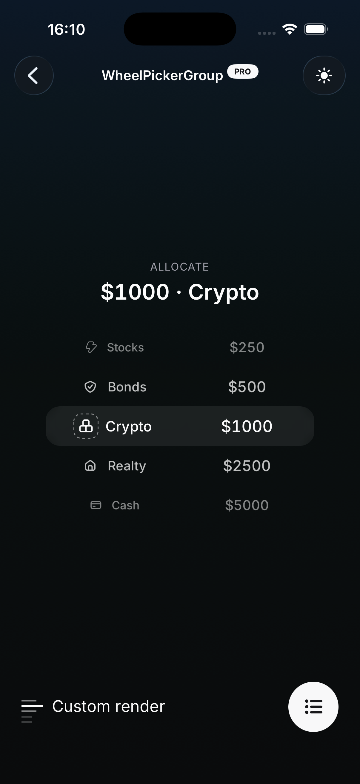
Features:
- Full light and dark token sets, including a dedicated chart ramp
- Real native backdrop blur on iOS, with an automatic opaque fallback everywhere else
- Flips the default
Overlayvariant tobluronBottomSheet,Dialog, andFAB— no code changes required - Applied with a single
@import, layered on top of the default styles - Ships its own
INSTALL.mdcovering setup and the Android/web fallback
Usage:
Install the blur provider, then import the theme in your global.css after the HeroUI Native styles:
npx expo install expo-blur@import 'tailwindcss';
@import 'uniwind';
@import 'heroui-native/styles';
@import 'heroui-native-pro/styles';
@import 'heroui-native-pro/themes/glass';
@source './node_modules/heroui-native/lib';
@source './node_modules/heroui-native-pro/lib';Real backdrop blur only exists on iOS. On Android, on web, and when expo-blur is not installed, every blur layer paints its fallbackColor token alpha-composited over --background instead — an intentionally opaque approximation, since a transparent layer would leave surfaces looking washed out. You never need to branch on the platform yourself.
For complete setup instructions, platform behavior, the Input structure change, and a live preview, see the Glass theme page.
Theme-Aware Background Layers
Translucent themes need a place to put the frosted layer, so 17 components now render an absolute-fill background container behind their surface. The layer only mounts when the active theme registers default background content — under default and brutalism nothing is rendered, so existing apps are pixel-identical.
Each layer is a real compound part, and its owner takes a background prop with three behaviors:
undefined— render the theme-aware default- a custom node — replace the default layer
null— remove the layer entirely
Each part is named after the surface it paints behind, so the layer is always easy to find from the part that owns it:
| Background part | Default layer scope |
|---|---|
Badge.Background | secondary variant, plus primary / soft with color="default" |
ChartCrosshair.ValueBackground | default value-pill variant |
EmptyState.MediaBackground | icon media variant |
FAB.ItemBackground | Action items |
NumberPad.KeyBackground | Keys — Backspace and Spacer default to null |
NumberStepper.RootBackground | Root surface |
ProgressBar.TrackBackground | Track surface |
ProgressButton.Background | Button surface |
RadioButtonGroup.ItemBackground | Unselected secondary variant items |
SlideButton.ContainerBackground | Container surface |
WheelPicker.IndicatorBackground | Highlight band |
WheelPickerGroup.IndicatorBackground | Shared highlight band |
Widget.Background | Widget root — Widget.Content keeps only its translucent tint |
ChartTooltip, CalendarYearPicker, and FlipCard gain the same layer through their own background parts, and ToggleButton forwards its background prop to the core Button.Background for the unselected default variant.
Usage:
import { GlassView } from 'heroui-native';
import { Widget } from 'heroui-native-pro';

// Retint the frosted layer
<Widget
  background={
    <Widget.Background>
      <GlassView intensity={80} fallbackColor="surface" />
    </Widget.Background>
  }
>
  {/* content */}
</Widget>

// Opt out entirely and paint your own surface
<Widget background={null} className="bg-surface" />
Blur layers are expensive, so avoid stacking them — a GlassView inside an already-frosted surface renders a second native blur pass for no visual gain.
FAB Blur Backdrop
FAB.Overlay gains a variant prop. The default variant paints the solid --backdrop fill it always has; the new blur variant renders an animated blur layer instead, driven by the same shared [idle, open, close] progress. Under the Glass theme it is the default.
<FAB>
  <FAB.Trigger>...</FAB.Trigger>
  <FAB.Portal>
    <FAB.Overlay variant="blur" blurViewProps={{ intensity: 60 }} /> {}
    <FAB.Content>...</FAB.Content>
  </FAB.Portal>
</FAB>
Improvements:
variant="blur"animates blur intensity rather than overlay opacity, soisAnimatedStyleActivedefaults tofalsefor it — set it back totrueif you drive a custom opacity animation throughanimationblurViewPropsforwards to the underlying BlurView, whereintensityacts as the maximum animated intensity (defaults to50in light mode and75in dark)- A requested
blurvariant is automatically downgraded todefaulton Android, on web, and whenexpo-bluris missing - Pin
variant="default"to keep the solid backdrop even under Glass
This brings FAB in line with BottomSheet.Overlay and Dialog.Overlay, which expose the same variant and blurViewProps API.
API Enhancements
Themeable Chart Ramp
The chart palette is no longer derived from --accent at render time. It now reads five dedicated tokens — --chart-1 through --chart-5 — which still default to accent-derived values, so nothing changes visually unless a theme overrides them. Glass ships its own cool-toned ramp on top of these tokens, and your own themes can redefine as many steps as they like:
@theme {
  --chart-1: oklch(0.65 0.06 240);
  --chart-2: oklch(0.55 0.05 240);
  --chart-3: oklch(0.45 0.04 240);
  --chart-4: oklch(0.35 0.03 240);
  --chart-5: oklch(0.75 0.06 240);
}
Every chart component — AreaChart, BarChart, LineChart, ComposedChart, PieChart, RadarChart, and RadialChart — picks up the ramp automatically.
Dependencies
expo-blur (optional)
expo-blur is loaded through an optional wrapper, so it stays a soft dependency: the package is only required if you use the Glass theme or a blur overlay variant, and its absence degrades gracefully to the opaque fallback rather than throwing.
npx expo install expo-blurBare React Native projects can install it too — expo-blur works outside Expo apps as long as expo-modules-core is set up.
⚠️ Breaking Changes
NumberPad Pressed Highlight Moved to an Inline Style
NumberPad.Key no longer carries data-[pressed=true]:bg-default-hover in its base class list. The pressed tint is now applied as an inline { backgroundColor: highlightColor } appended last to the key's containerStyle, so a theme can drive the highlight without fighting the class layer.
Two consequences for existing code:
- A pressed background override passed through
className(e.g.data-[pressed=true]:bg-red-500) is now silently beaten by the inline style, since inline styles always win in React Native numberPadClassNames.key()returns a different string, so anything composing it sees changed output
There is no deprecation warning — the class simply stops taking effect — so audit any data-[pressed=true]:bg-* classes on number pad keys when you upgrade.
Migration:
Move pressed-state background overrides off className and onto the new highlightColor prop:
// Before
<NumberPad.Key value="1" className="data-[pressed=true]:bg-red-500" />

// After
<NumberPad.Key value="1" highlightColor="#ef4444" />
Everything else in this release is additive. Background layers only mount when the active theme registers default background content, so default and brutalism render exactly as before, and the --chart-* tokens keep their previous accent-derived values as defaults.
Updated Documentation
The following documentation has been added or updated to reflect the changes in this release:
- Glass — New theme page covering
expo-blursetup, theheroui-native-pro/themes/glassimport, platform behavior and fallbacks, theInputstructure change, blur backdrops, and layer customization - Themes — Overview page now showcases the Glass theme alongside Default and Brutalism
- FAB — Documents the
Overlayvariant/blurViewPropsprops and the newFAB.ItemBackgroundpart - Badge — Documents
Badge.Backgroundand the variants its default layer covers - EmptyState — Documents
EmptyState.MediaBackgroundfor theiconmedia variant - ChartCrosshair — Documents
ChartCrosshair.ValueBackgroundfor the value pill - ProgressBar — Documents
ProgressBar.TrackBackground - ProgressButton — Documents
ProgressButton.Background - SlideButton — Documents
SlideButton.ContainerBackground - ToggleButton — Documents the
backgroundprop forwarded to the coreButton.Background - NumberPad — Documents
NumberPad.KeyBackgroundand the transparentBackspace/Spacerdefaults - NumberStepper — Documents
NumberStepper.RootBackground - RadioButtonGroup — Documents
RadioButtonGroup.ItemBackgroundfor unselectedsecondaryitems - WheelPicker — Documents
WheelPicker.IndicatorBackground - WheelPickerGroup — Documents
WheelPickerGroup.IndicatorBackground
Links
1.0.0-beta.9
Adds Agenda, Autocomplete, and ComboBox, plus RTL layout support across components with example-app localization for English, Arabic, and Hebrew.
1.0.0-beta.7
Adds the Brutalism theme and extracts every component's styles into overridable BEM CSS, so a single import can restyle the entire library.