Glass
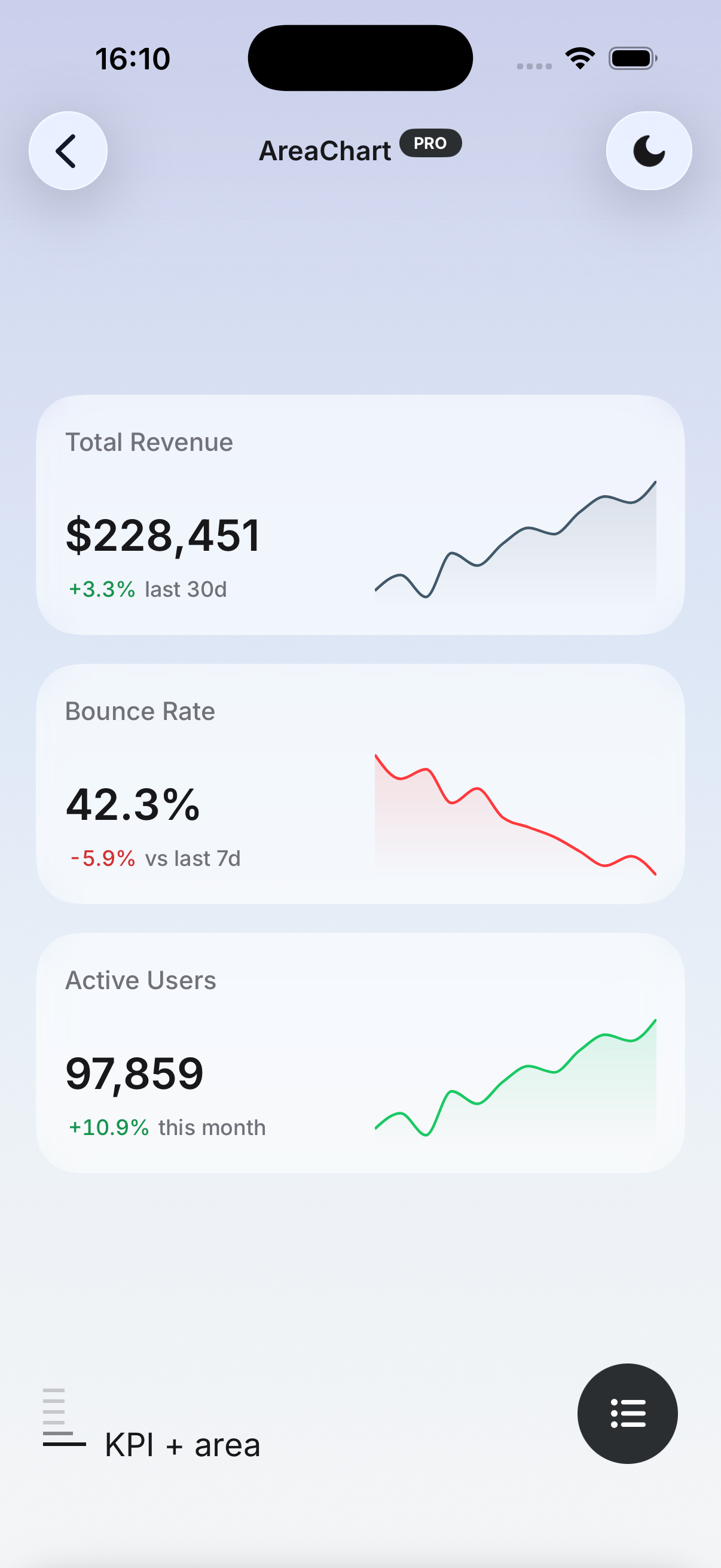
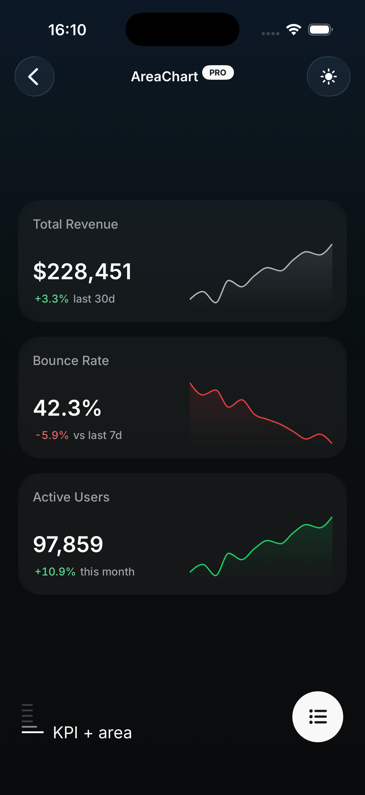
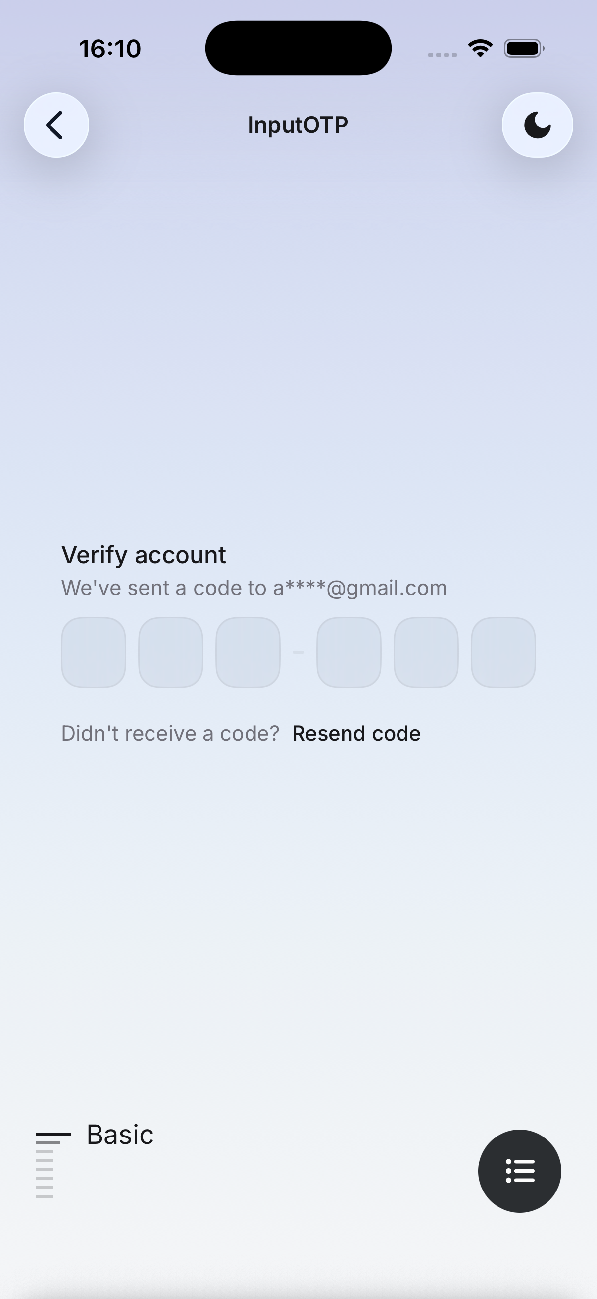
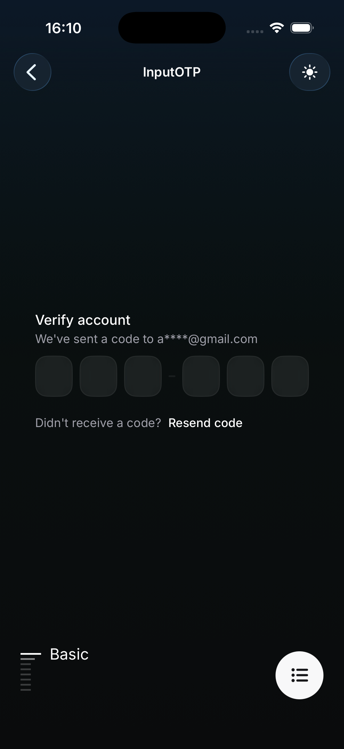
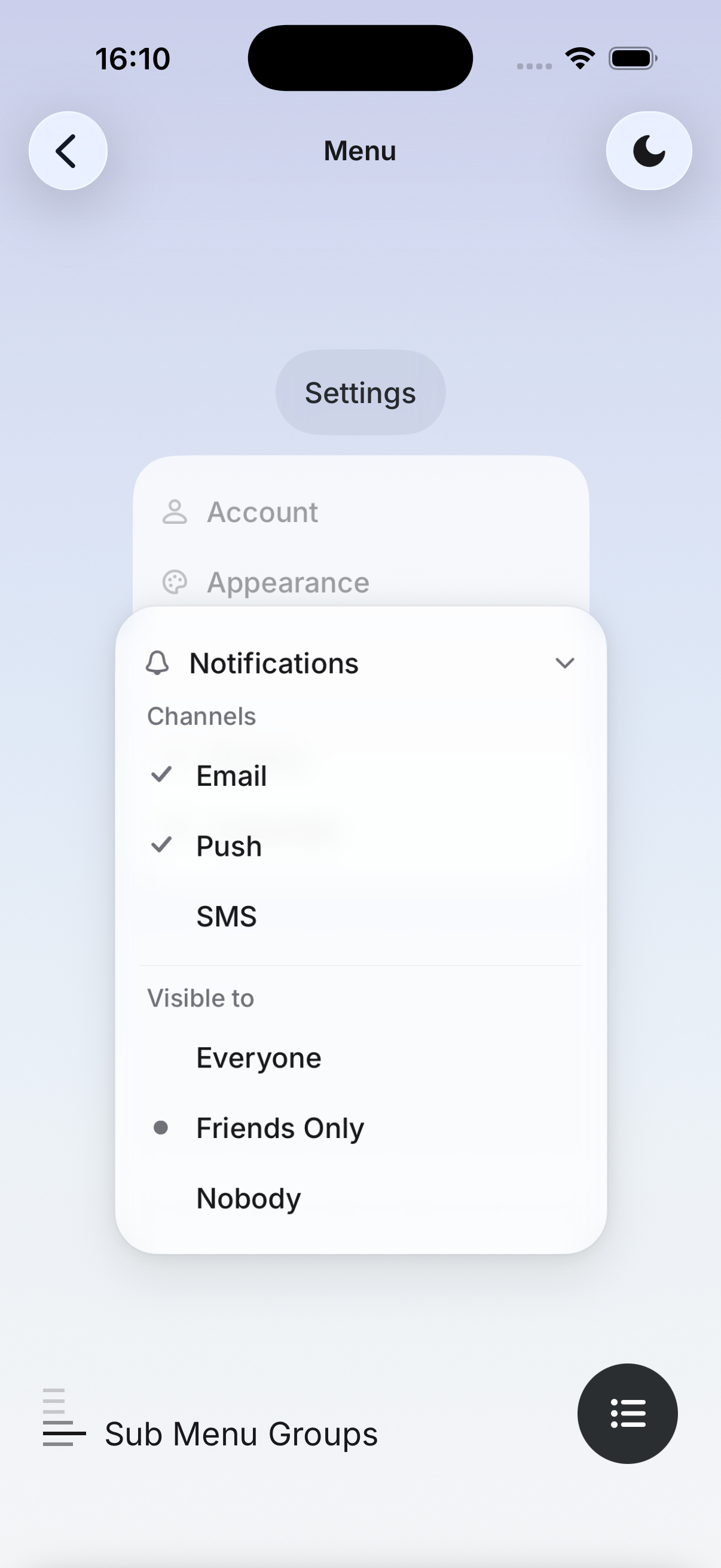
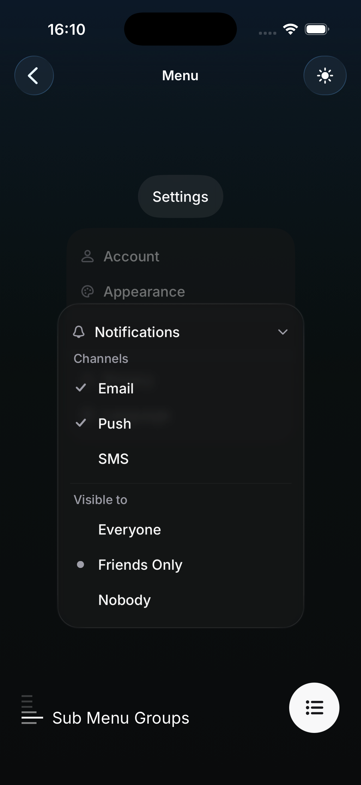
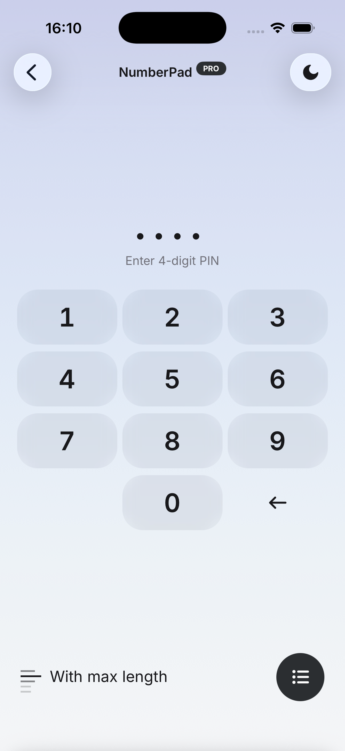
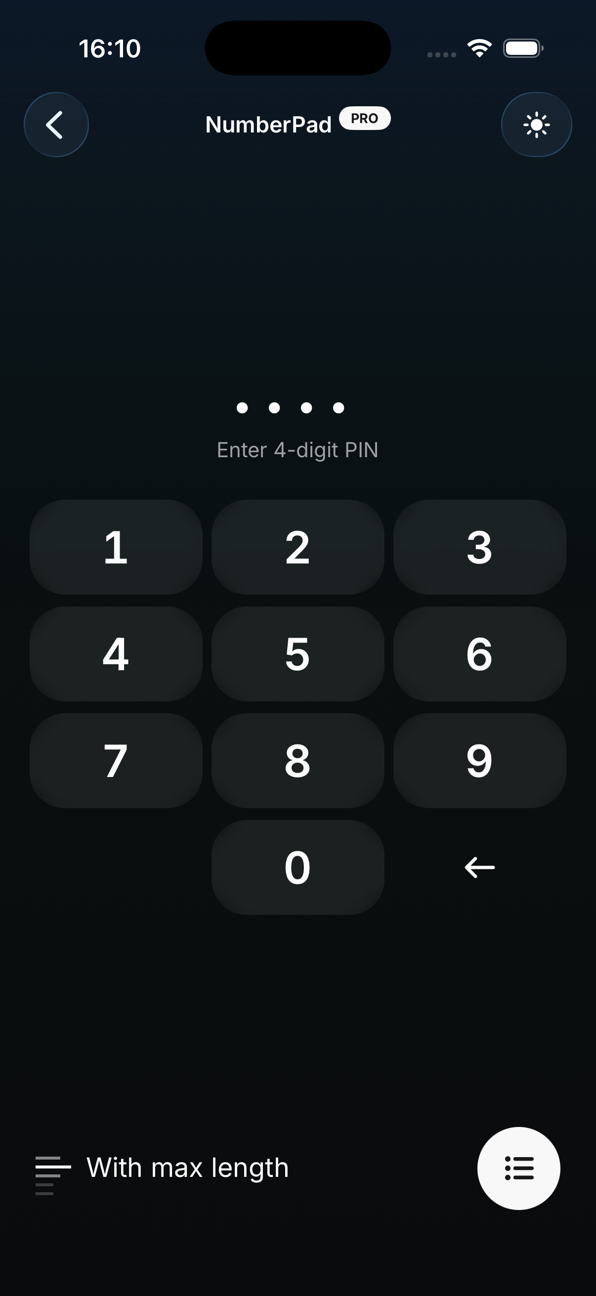
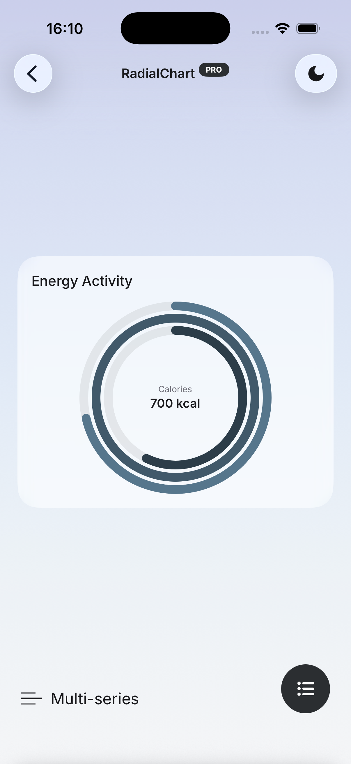
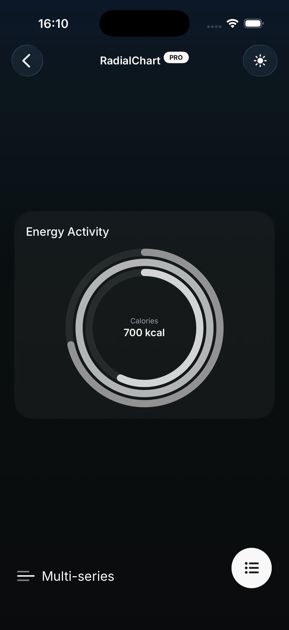
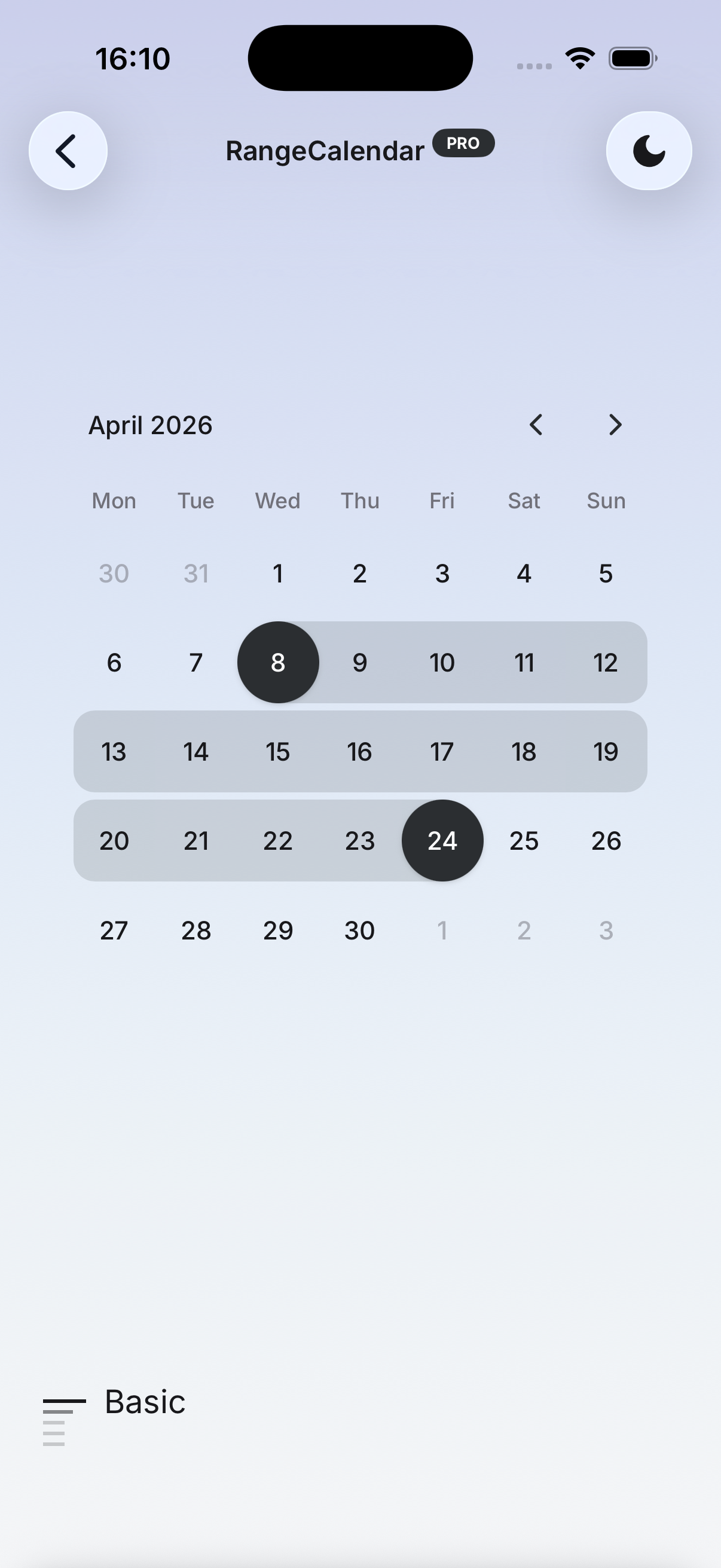
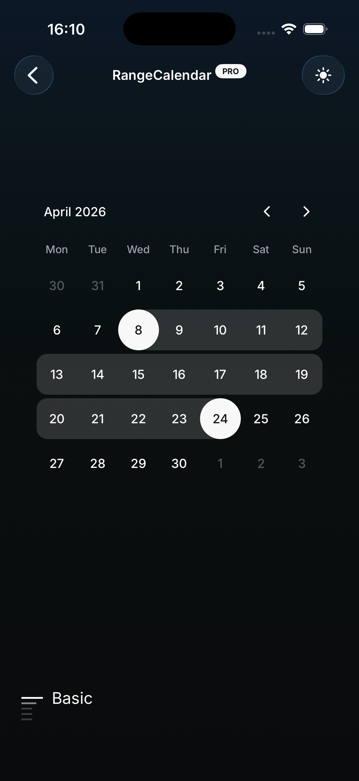
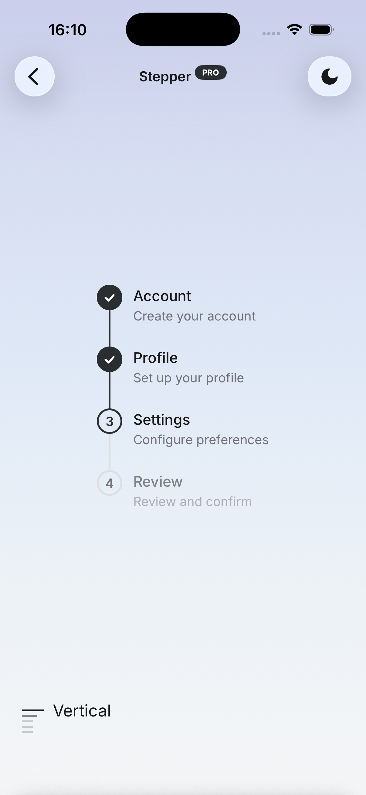
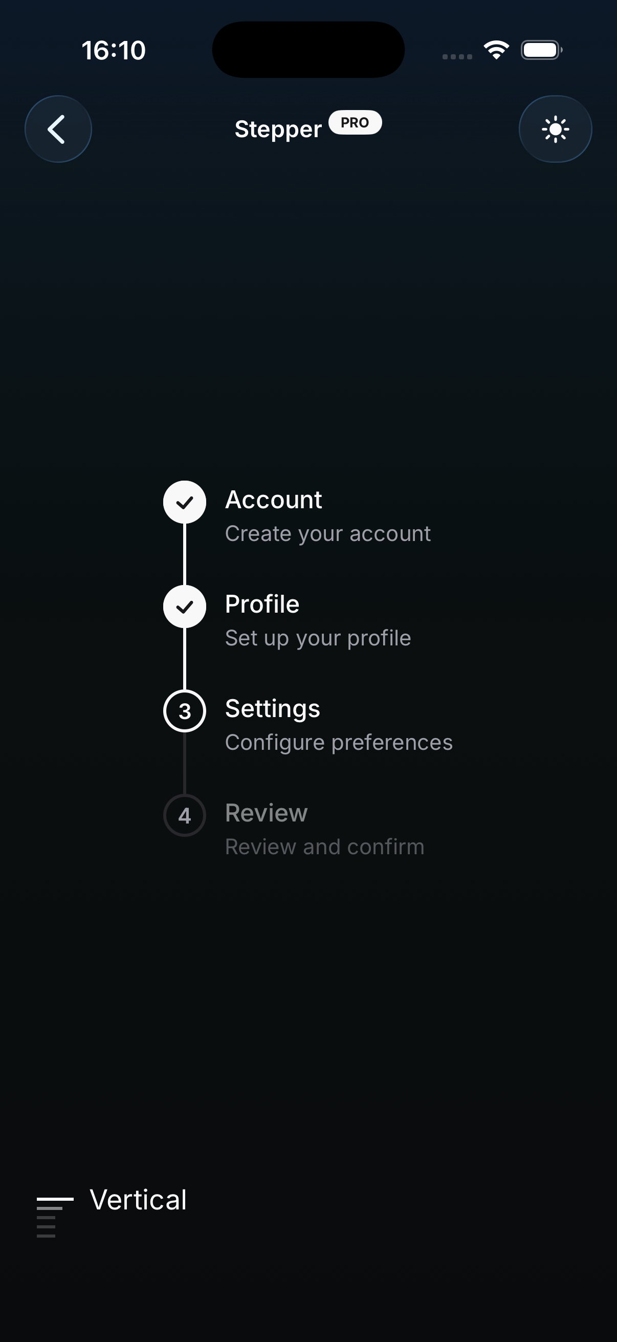
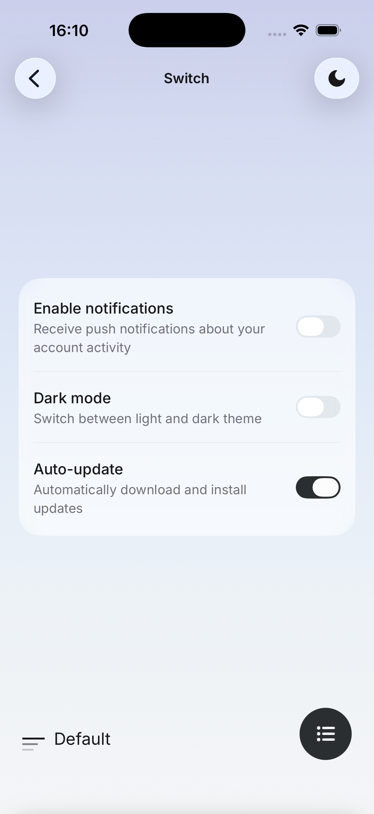
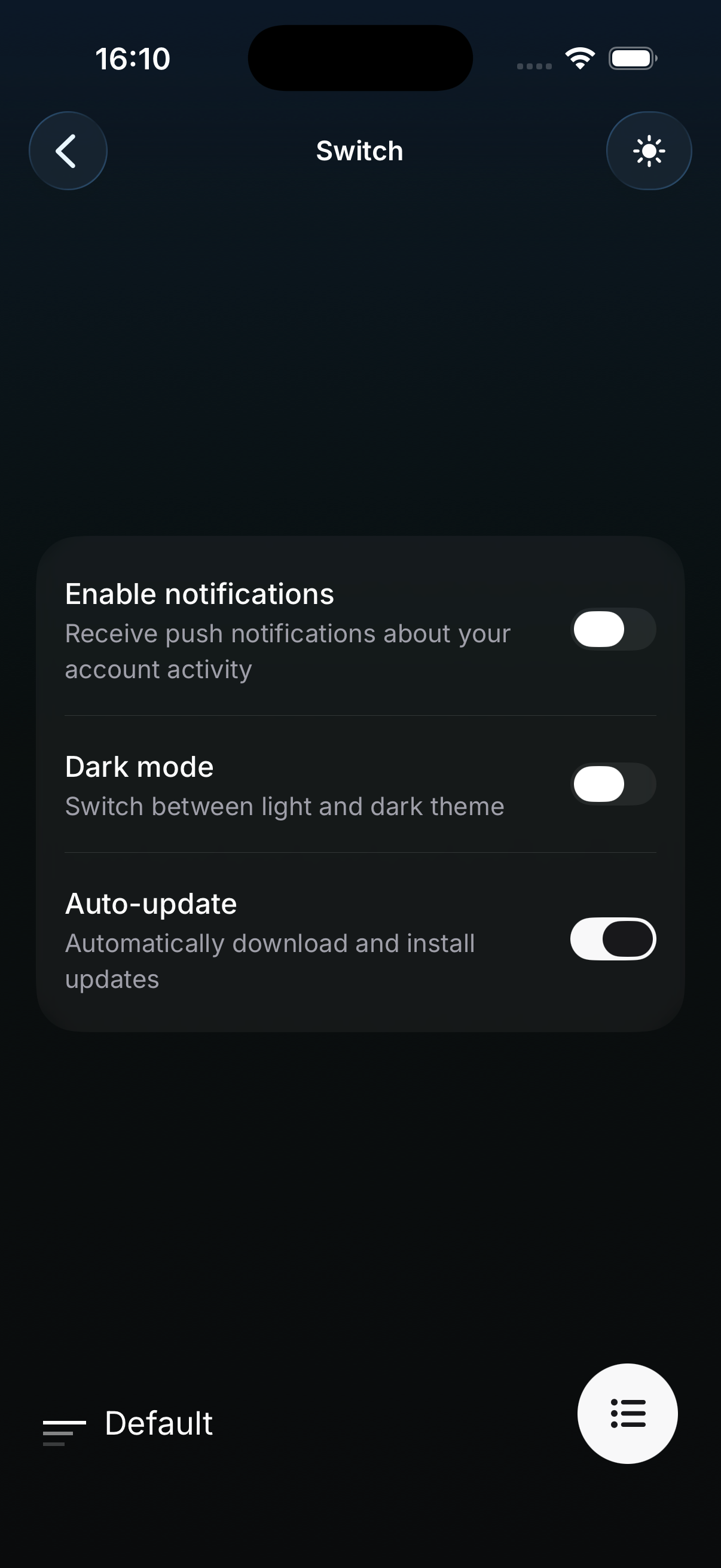
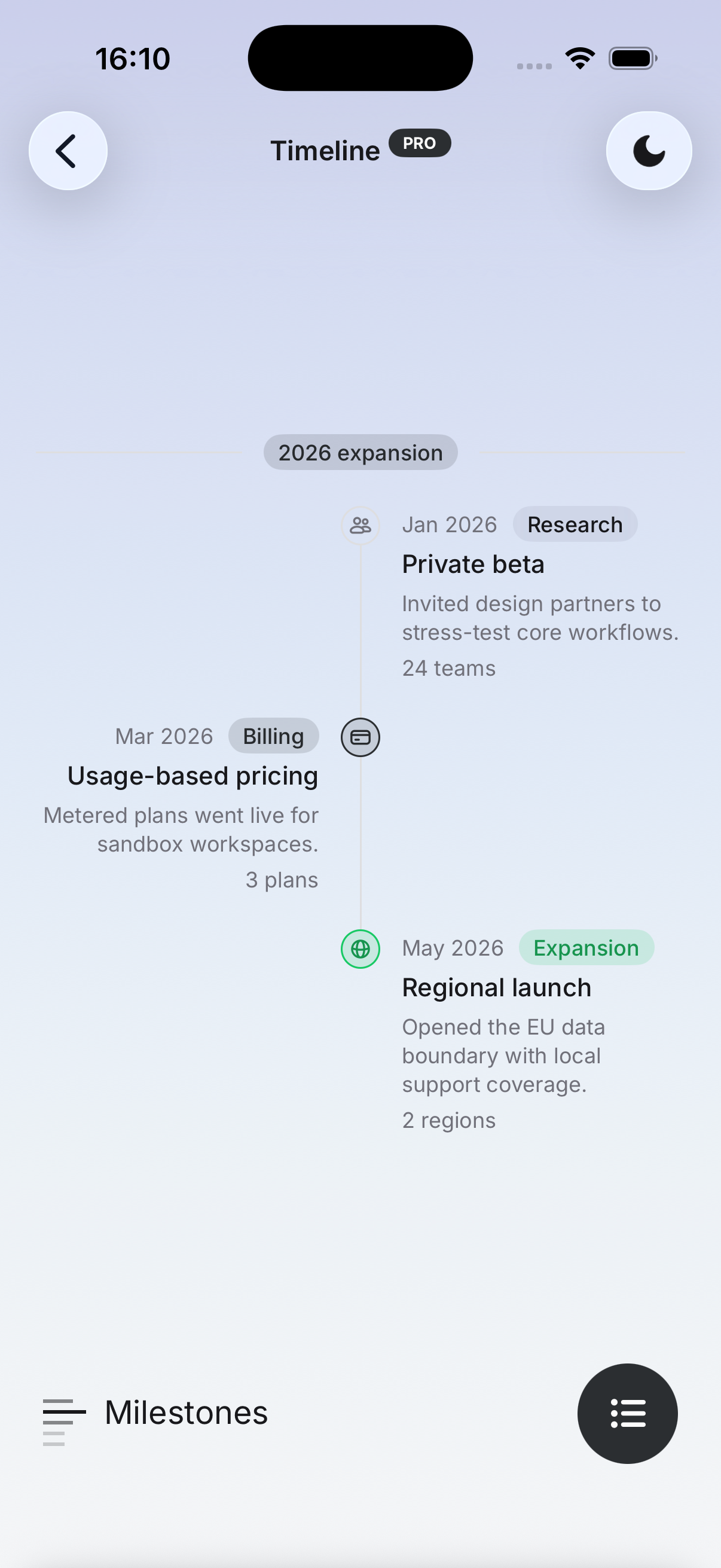
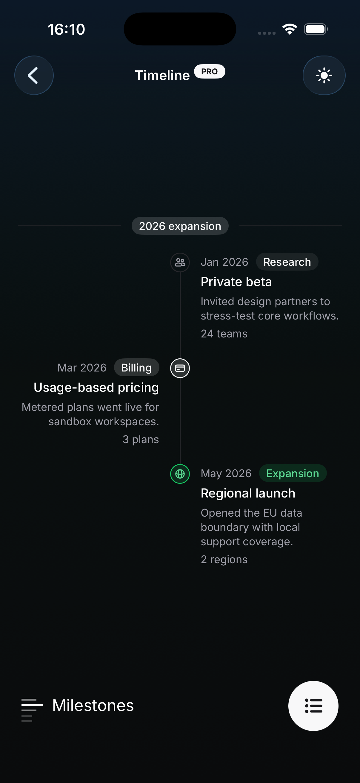
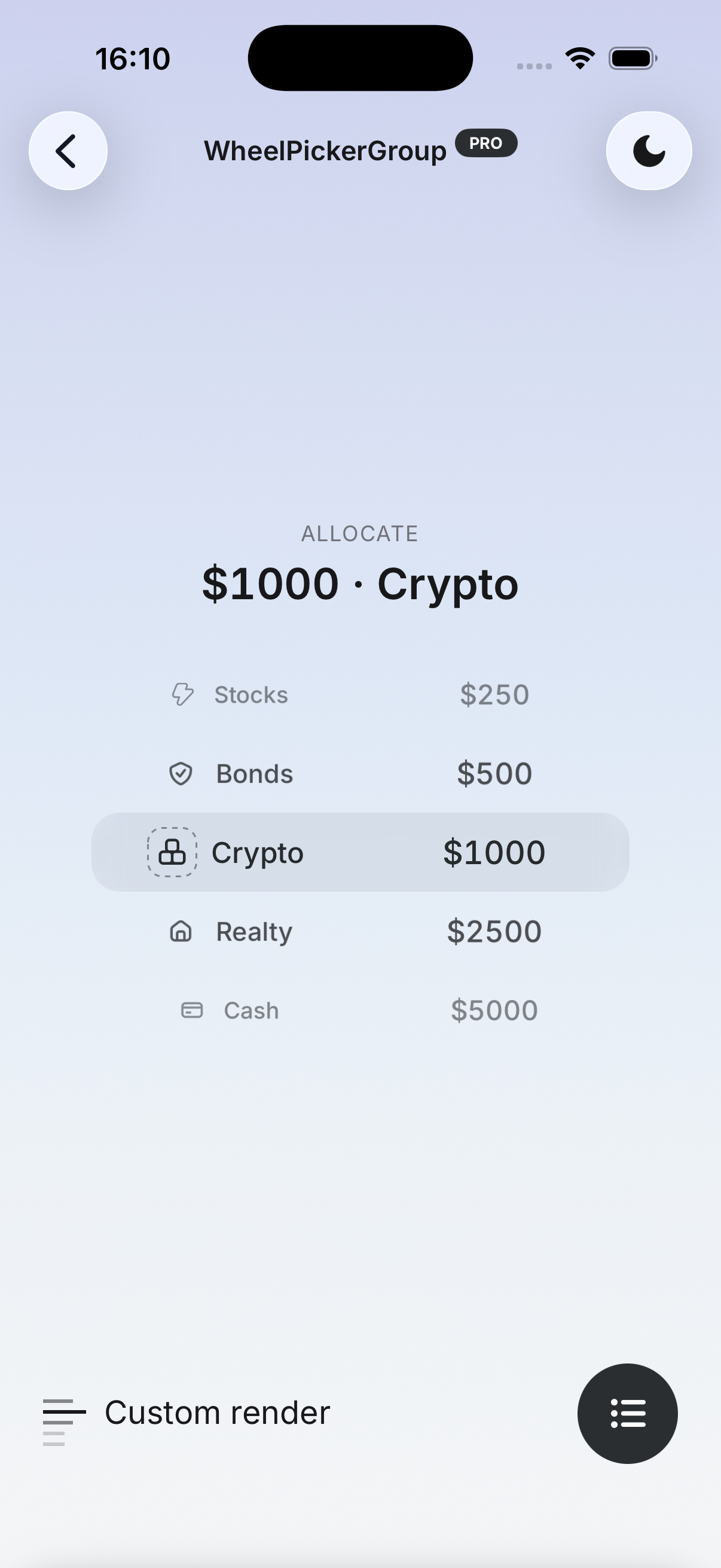
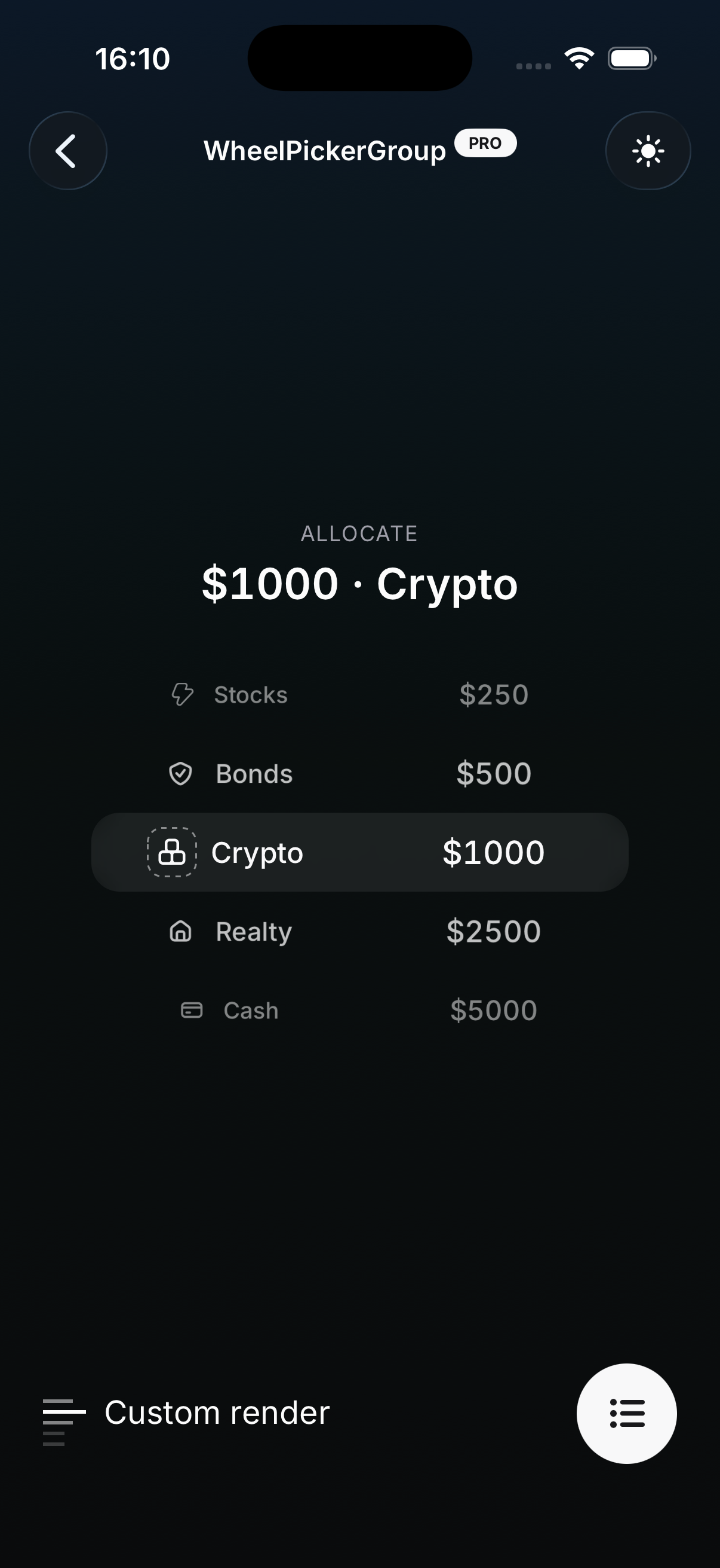
Frosted translucent surfaces and real iOS blur — a soft, layered take on every component.
The Glass theme restyles every HeroUI Native Pro component with translucent surfaces and frosted blur layers. Unlike the other themes, it is not CSS-only: overlays, fields, and surfaces mount a real blur layer at runtime, which means there are a few things to know before shipping it.
Preview
Installation
The Glass theme is included with HeroUI Native Pro. If you haven't installed the Pro package yet, follow the Installation guide first.
1. Install expo-blur
The blur layers are powered by expo-blur, the only supported blur provider:
npx expo install expo-blurBare React Native projects can install it too — expo-blur works outside Expo apps as long as
expo-modules-core is set up. Without it,
every platform renders the opaque fallback described below.
2. Import the theme
Import the theme in your global.css after the HeroUI Native styles:
@import 'tailwindcss';
@import 'uniwind';

@import 'heroui-native/styles';
@import 'heroui-native-pro/styles';
@import 'heroui-native-pro/themes/glass';

@source './node_modules/heroui-native/lib';
@source './node_modules/heroui-native-pro/lib';
Order matters. The Glass theme overrides the surface, field, and overlay tokens set by
heroui-native/styles, so importing it before the base styles silently disables the theme.
Platform Behavior
Real backdrop blur only exists on iOS. Everything else falls back to an opaque approximation, so plan your designs around both outcomes:
| Platform | Result |
|---|---|
iOS with expo-blur | Native blur layer; translucent theme tokens frost through it |
Android, web, or no expo-blur | Opaque color: the layer's fallbackColor token alpha-composited over --background |
The fallback is intentionally opaque rather than transparent — a transparent layer would leave surfaces looking washed out on Android. Every background part picks a matching token by default (field for inputs, surface / surface-secondary / surface-tertiary for surfaces, overlay for popups), so you rarely need to touch it. When you do, pass fallbackColor to GlassView:
import { GlassView } from 'heroui-native';

<GlassView fallbackColor="surface" />;
Text Input
This is the one component whose structure changes under the Glass theme, and it is the most common source of surprises.
On other themes, Input renders a bare TextInput as its root. On Glass, it needs somewhere to put the frosted layer, so it wraps the text input in a container View:
// Default theme
<TextInput />

// Glass theme
<View>
  <Input.Background /> {/* the frosted layer */}
  <TextInput />
</View>
Two consequences:
Layout classes belong on containerClassName, not className. With a background layer present, className lands on the text input and containerClassName lands on the wrapper. On themes without a layer both are merged onto the text input, so containerClassName is the portable place for sizing and positioning:
<Input
  containerClassName="flex-1"
  className="px-10"
  placeholder="Search"
/>
Don't paint an opaque background on the input itself. A bg-* class on className sits above the frosted layer and hides it. Tint the layer instead, or remove it and style the input directly:
// Hides the blur
<Input className="bg-white" />

// Customize the layer instead
<Input
  background={
    <Input.Background>
      <GlassView intensity={60} fallbackColor="field" />
    </Input.Background>
  }
/>

// Or opt out entirely — bare text input, style it however you like
<Input background={null} className="bg-white" />
The ref still points at the underlying TextInput on every theme, and the same rules apply to everything built on Input — TextField, SearchField.Input, and TextArea. InputOTP frosts each slot instead, through its own InputOTP.SlotBackground part.
Blur Backdrops
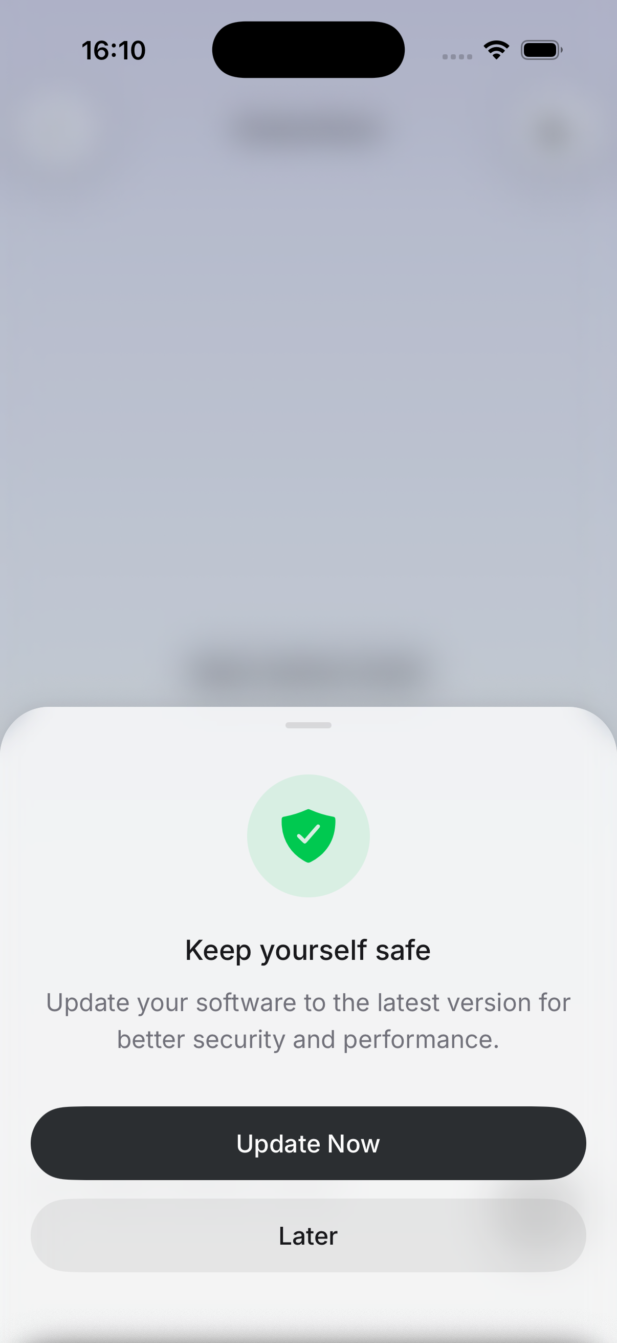
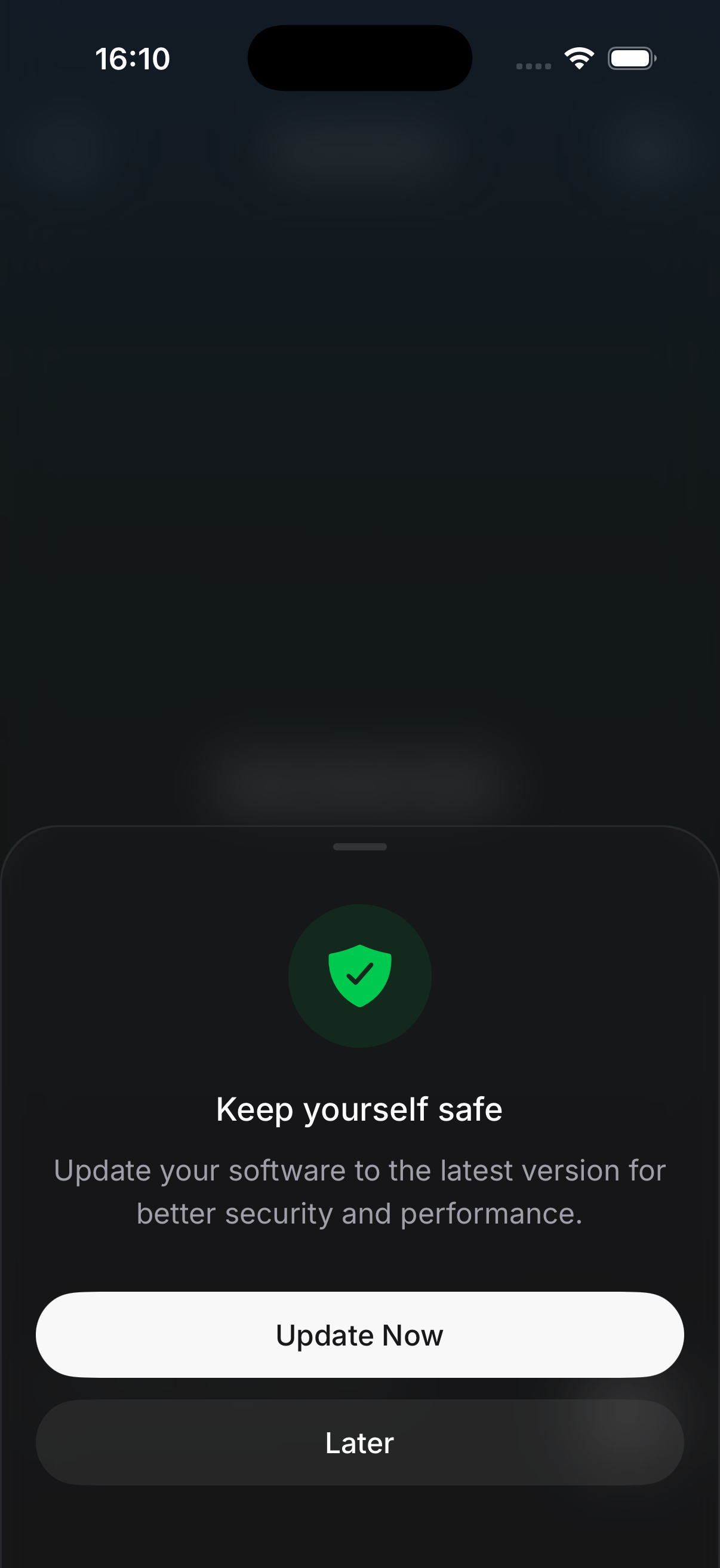
BottomSheet, Dialog, and FAB all expose an Overlay part with a variant prop. Under the Glass theme its default flips from default (a solid --backdrop fill) to blur, so you get an animated blur backdrop without changing any code:
<Dialog.Portal>
  <Dialog.Overlay /> {/* blur under Glass, solid elsewhere */}
  <Dialog.Content>...</Dialog.Content>
</Dialog.Portal>
Tune the maximum blur with blurViewProps.intensity (defaults to 50 in light mode and 75 in dark), or pin the variant explicitly to opt out:
<BottomSheet.Overlay variant="blur" blurViewProps={{ intensity: 40 }} />

<FAB.Overlay variant="default" /> {/* keep the solid backdrop on Glass */}
The blur variant animates blur intensity instead of opacity, so isAnimatedStyleActive
defaults to false for it. If you were relying on a custom opacity animation via the animation
prop, set isAnimatedStyleActive back to true.
A requested blur variant is automatically downgraded to default on Android, on web, and when expo-blur is missing — you never need to branch on the platform yourself.
BottomSheet is the exception to the compound-part pattern for its sheet background (not its
overlay). Because the sheet is rendered by
@gorhom/bottom-sheet, customize its frosted
layer through a custom backgroundComponent that renders BottomSheet.Background or GlassView.
Customizing a Layer
Every component that mounts a frosted layer exposes it as a compound part — Dialog.ContentBackground, Popover.ContentBackground, Input.Background, Widget.Background, Surface.Background, and so on. Pass it to the owning part's background prop to change intensity, tint, or the fallback color:
<Popover.Content
  background={
    <Popover.ContentBackground>
      <GlassView intensity={80} tint="light" fallbackColor="overlay" />
    </Popover.ContentBackground>
  }
>
  ...
</Popover.Content>
Passing background={null} removes the layer entirely.
Blur layers are expensive. Avoid stacking them — a GlassView inside another already-frosted
surface renders a second native blur pass for no visual gain. This is why Widget.Content keeps
only its translucent tint and composites over the widget root's layer.